Ads manager navigation redesign exercise
Using a task analysis framework, I started this redesign project by identifying key areas within a product that would meet immediate user needs, and help them achieve their end goals.
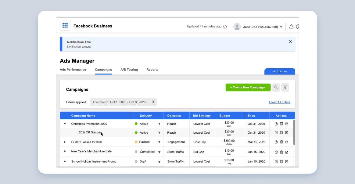
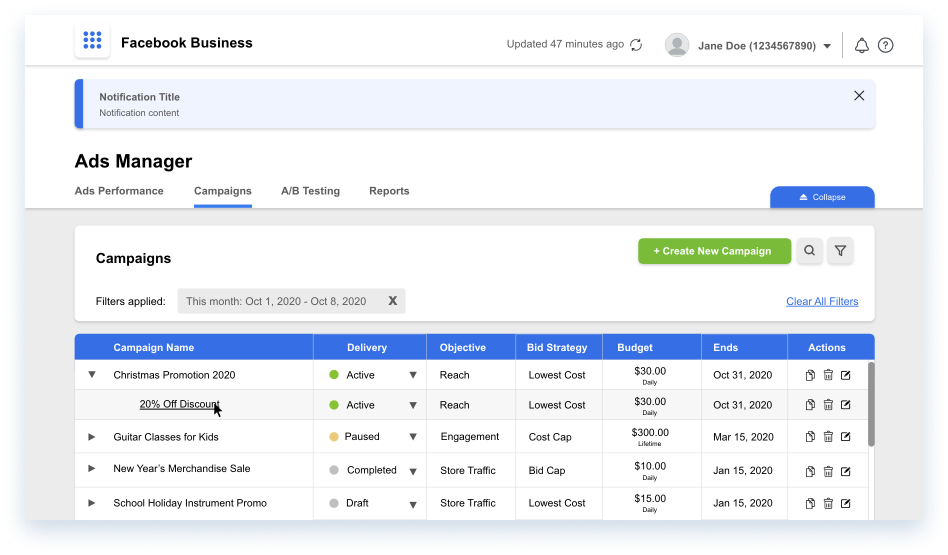
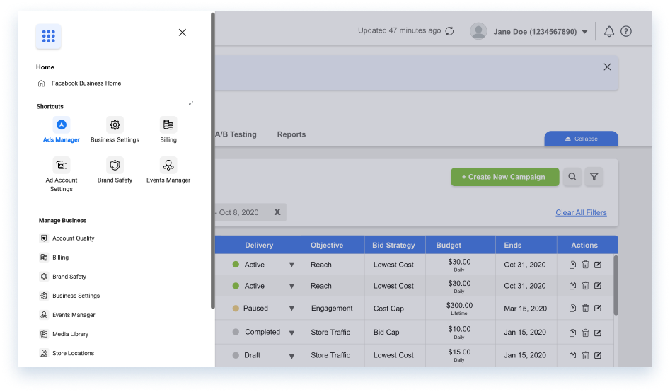
Facebook Ads manager
The Problem
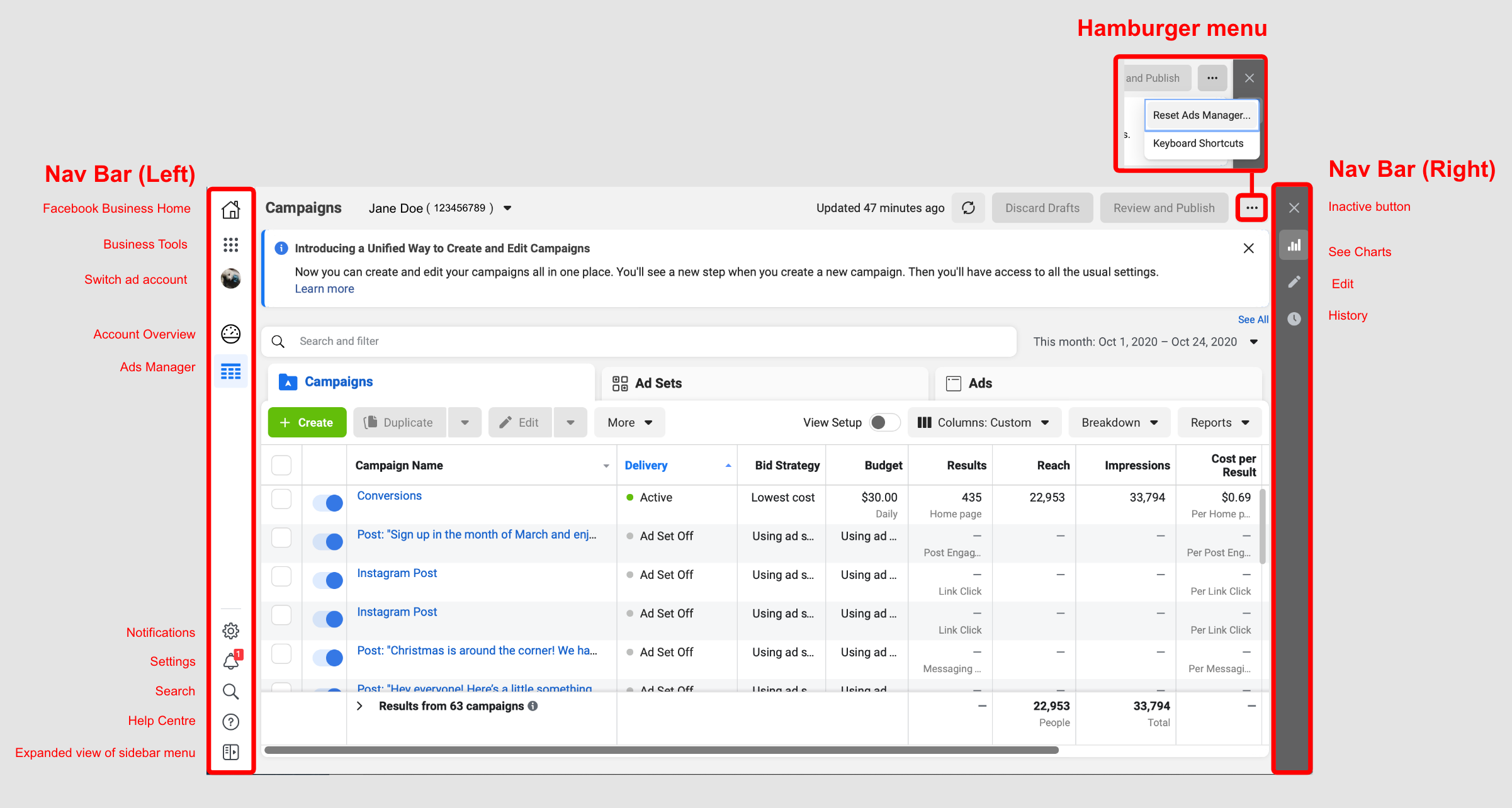
An information-heavy workspace with no visible workflow options, weak visual hierarchy, and multiple navigation bars.
- Multiple navigation bars that reveal/collapse in different directions.
- Icons and shortcuts that provide little context or relevance to the user.
- Collapsible, content-heavy drawers that overlap onto the main navigation screen.
- Poor content organization and deeply nested information.
- Unclear status indicators.
Step 1: Task breakdown
Users will log into the Ads Manager and engage in one of several potential tasks below in no particular sequence:
- Check on the performance of their ad(s).
- Create, edit, delete, or duplicate an ad.
- Calibrate their ad settings and budgets according to advertising goals.
- Publish, pause, or unpublish an ad.
- Conduct A/B testing.
- Generate and download reports
Step 2: User observation
5 key types of data to collect for task analysis:
- Trigger: What gets users to start their task.
- Desired Outcome: How they will know when the task is complete.
- Base Knowledge: What will the users be expected to know when starting the task.
- Required Knowledge: What they need to know to complete the task.
- Artifacts: What tools or information do they use in the course of the task.
In Application:
- Trigger: The need to effectively advertise their business’s products and services, and/or spread brand awareness to potential and existing customers.
- Desired Outcome: Published ads display clear status indicators, timestamps showing the last update on their displayed performance results, and clear action buttons.
- Base Knowledge: Users should be aware that the platform is a one-stop solution for their Facebook and Instagram advertising needs.
- Required Knowledge: They need to know and configure particulars of an ad strategy
- Artifacts: Referencing the task breakdown completed above in Step 2, I can expand and deduce the following tools to be the predominantly used tools/features within the site.
Redesign
Starting with the navigation bar, information on the screen is pared down. The main user tasks are re-categorized according to user goals:

- Ads Performance: Data visualization tools, and data grids comparing ad performance.
- Campaigns: A workspace to create ads, view all ads, and edit ads.
- A/B Testing: Workspace with A/B testing tools and results.
- Reports: A report generator and shared repository to store and share reports with other organization members.
The final result is a cleaner, more user-friendly workspace.
Clearly distinguished from the rest of the content on the screen, the top most navigation section contains Facebook Business’s master navigation menu, the refresh button, profile settings, notifications, and help button.

Before
Old menu design floats on top of the data grid, resulting in visual clutter.
After
Redesigned drawer menu extends to the full length of the screeen, with a tinted backdrop.